We have updated the content of our program. To access the current Software Engineering curriculum visit curriculum.turing.edu.
CSS Performance and Organization
Goals
By the end of this lesson, you will:
- Deepen your understanding of how browsers read CSS selectors
- Know how to utilize best practices around writing effective CSS
- Be able to plan and execute well-structured CSS
CSS Organization
We all want to write clear CSS that’s easy to maintain, but as a project grows and more people are touching the codebase, that goal can quickly morph into an unwieldy challenge. Once-organized stylesheets can rapidly degrade into a giant pile of spaghetti code. However, we can help maintain the integrity of our CSS by keeping a few concepts and rules in mind.
Naming Conventions
Every programming language has its own conventions around naming. CSS, although not exactly a language, is no exception.
There are several different naming conventions. Here are some you will see often:
Camel case uses capital letters to form a compound word rather than spaces to separate words. Generally, the first word is lower case, and any following words are capitalized. The capital letters popping up look a little bit like a camel’s hump. Example: thisIsCamelCase. You may see examples that begin with a capital letter, which is known as UpperCamelCase.
Snake case uses an underscore to separate lowercase words. Its called “snake case” because it is reminiscent of a snake slithering along the ground. Example: this_is_snake_case
Similar to snake case, kebab case uses dashes to separate words (note: there is some disagreement about what this convention is called, and some refer to it as “lisp case”, or even as a variation of “snake case”). “Kebab” references the dashes skewering the words together, much like a shish kebab. This is the standard for CSS and HTML. Other naming conventions will still work, but kebab case is likely to be what you’ll see used most commonly with HTML and CSS. Its good to get into the habit of using it. Example: this-is-kebab-case
For our purposes, we’ll be using kebab case.
Selector Rules
A CSS rule consists of a selector and a declaration block. The selector indicates which HTML element we want to style. The declaration block specifies what styles we apply to that HTML element. We can group our CSS rules into four main categories:
- ID rules
- Class rules
- Tag rules
- Universal rules
In a rule that uses more than one selector to target an HTML element, the last part of the selector is known as a key selector. The key selector is what matches the exact HTML element to which the style is being applied, rather than its ancestors.
For example, key selectors would be the p, a, and img selectors below:
section p,
ul li a,
footer img {...}
As we can see in this example, selectors are read starting on the right with the key selector, then moving to the left. A key selector can be an ID, Class, Tag, or Universal rule.
An ID Rule has a id selector as its key selector:
aside #main {...}
p #footer {...}
button #hero:hover {...}
Similarly, a Class Rule has a class selector as its key selector:
section .container {...}
.three-column {...}
.main-content {...}
If there is no id or class, then the Tag Rule is used. When we want to use an HTML tag itself as the key selector, it falls into this category:
article {...}
header {...}
li {...}
A Universal Rule is applied to the entire HTML page.
* {...}
How this effects our efficiency and organization
Our styles are matched starting with the key selector then moving left. The browser will continue to look further up this tree of selectors as it narrows down the matches for the rule, until it either finds the match or abandons it because of a mismatch.
This is a primary concept to understand: the rule categories exist to filter out irrelevant rules so the systems trying to filter them doesn’t waste time trying to match things unnecessarily. Our CSS will be more effective for both the systems rendering it and the people working with it if we keep the number of rules needed for each element to a minimum.
The rules listed above are in order of efficiency. Example: only ID rules that match an element’s id will be checked, only Class rules for a particular class will be checked, only Tag rules that match a specific tag will be checked, and Universal rules will always be checked.
General Guidelines
Avoid Universal Rules
Because Universal rules are always checked, they should be used sparingly.
ID and Class rules don’t need a tag name
By putting an id or class on a tag, you are already clearly indicating where you want a specific style applied. In the majority of cases, this means it’s unnecessary to include the tag to which you’ve applied an id or class.
For example:
nav #primary-navigation {...}
p .secondary-content {...}
would be better written like this:
#primary-navigation {...}
.secondary-content {...}
On Being Too Specific
Using a long list of tags and selectors to narrow down where you want a style applied is inefficient from a systems perspective and it’s also inefficient from a human point of view – if it’s too complicated for another developer (or future-you) to figure out where to make a change to CSS reasonably quickly, a new CSS rule may just get slapped onto the bottom of the stylesheet. That will result in styles that are bloated and unwieldy to manage. Here’s an example of what a long list of selectors might look like:
header nav ul li a .nav-link {...}
}
You can see that this is extremely specific. We won’t be able to reuse these styles or easily refactor our code, simply because we’ve made them so locked into this particular structure for navigation in our header. But if we think about it, it’s very possible that we will want to refactor this HTML at some point. With this multi-selector approach, we’ll break our styles if we refactor our HTML. It would be nice to write the styles once, then have the flexibility to apply the class to any HTML tags as needed. We can do that with just a little clean up:
.nav-link {...}
}
We’ve eliminated unnecessary specificity, made our CSS more reusable, and it still does exactly the same thing in our header navigation.
Performance Beyond Selectors
In the early 2000’s, how developers structured their CSS selectors had a big impact on a page’s efficiency. Understanding how the browser read through and gave precedence to certain key selectors over others was a critical skill to have if you wanted your site to work well. Today, conforming to the guidelines that were necessary to optimize page performance allows us to write modular and understandable styles that make it easier and faster for humans to understand our CSS. These early best practices are still relevant and important but there have been advances, as outlined by Nicole Sullivan here, that allow us to write CSS in a way that makes the most sense for the site architecture we want, rather than which selectors are going to be most efficient to render.
Style Sharing
This change significantly lightens the workload on the browser. Once a browser has figured out how to style one element in the style tree, it won’t need to do it again for the same type of element in the same context. For example, if the browser has calculated the styles for one paragraph, it won’t have to again for the following paragraphs it encounters:
<section>
  <p>Only</p>
  <p>Calculated</p>
  <p>Once</p>
</section>
Rule Hashes
This takes the idea of a key selector one step further. Rule hashes break your stylesheet into key selector-based groups. This means the browser only has to look through styles with a key selector of p in the following example:
section p {...}
nav {...}
.hero-unit p {...}
#sidebar p {...}
.main-content {...}
This is nice because it means the browser isn’t looking through every selector. It can very quickly narrow its search to find which selectors could match.
Ancestor Filters
Ancestor filters are probability filters that calculate the likelihood a selector will match. This is a tricky piece of fancy footwork that means the browser can very quickly eliminate rules when an element doesn’t have the required matching ancestors. It tests for descendant and child selectors, making matches based on id, class, and tag. This filtering approach has taken something that was a slow process and almost made it a non-issue using a bloom filter.
A bloom filter is a data structure that is “used to test whether an element is a member of a set” – in this case, checking to find if our selectors match! Bloom filters allow false positives, but not false negatives, so as soon as they hit a non-match the browser knows it can stop looking there and move on. Because large stylesheets will have more false positives to check, it’s still a good idea to keep your CSS lean.
In short: modern CSS and browsers have evolved to be fairly speedy, and the key to making sure we don’t get in their way is to be mindful of file size and moderate in our use of selectors.
Planning and Organizing Content
We’ve discussed how our selectors are read, and how browsers have evolved to make the process of narrowing selectors speedy. We know that writing lean and organized CSS will help keep these processes efficient. Well-written CSS will also make it easier for us humans to understand and maintain. As is often the case in the programming world, there are different schools of thought around how to organize and structure code to achieve this optimized ‘lean and organized’ state. We’ll be discussing how to think about structuring your content based on the process outlined in Jonathan Snook’s guide, Scalable and Modular Architecture for CSS.
Jonathan proposes grouping your HTML elements in your styles using 5 primary categories. These categories help developers focus on organization of content, structure, and naming conventions. These 5 categories are base, layout, module, state, and theme.
Base Styles
Base level styles may be applied to the whole site, and are limited to tag, or element, selectors like html, body , h1, h2, h3 and CSS resets/normalizers. Styles in this base category set the foundation for everything else you add to build your site. Ideally, base category styles are very minimal. These may be setting the margin on body, a background color for the page, or pulling in a custom font to be used throughout the site.
Layout Styles
Layout level styles identify the main structural elements and main layout sections/containers on the page. For example, these containers might include a header, sidebar, main-content. At this point, we are not focused on what the content is or how it looks, we’re just interested in defining the structure of our page.
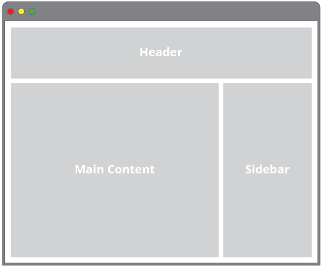
It’s also a good place to think about how to approach making your layout responsive, because we’re working with the basic form of major section blocks. Layout styles effectively function as your grid system, which allows you to figure out your responsive strategy broadly first, before you start dealing with the layout of the detailed content inside.
It’s really all about figuring out what the primary chunks of your layout/page are, and deciding how you’re going to group and work with them.
Module Styles
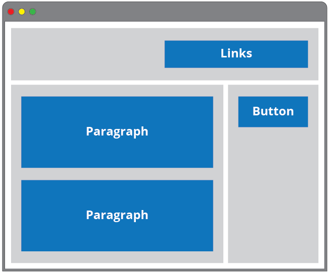
Module level styles make up the content pieces within layout elements. This might include a list of links for a navigation or article text and content. The majority of the styles in your project will be module styles.
Fortunately, designers work very hard to create cohesive visual languages for digital products. You’ll find that a solid design concept will often result in many repeating visual elements and stylistic choices, which translates into more reusable code.
Each module you create is an interface that a user has to learn to use. After it is carefully thought through and created by a designer, it has to be written, delivered and maintained by a developer. This is good reason to simplify your CSS, and write modular and reusable code.
A module may have variations on its basic visual structure. Buttons are a common example where we may want them to share an overall consistent style, but might want to vary their size or color based on their specific use. For example, ‘delete’ buttons tend to be red, while ‘submit’ or ‘success’ buttons might be green.
In these cases, we identify our base module styles, and refine them with sub-module styles. We are applying a base style to a single element (i.e. a button), then iterating on that style with additional selectors that identify our altered buttons. For example, we may have a basic button style, and a destroy button style which might change the background color:
<button class="btn">Basic Button</button>
<button class="btn btn-destroy">Delete Button</button>
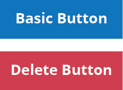
It’s ok to use more than one selector to apply our styles because it gives us additional flexibility and allows us to reuse our code as much as possible. It’s about identifying patterns in your layout.
We can have child elements within a module that have specific styles applied to them. This means that we want to be able to identify these elements and have them associated specifically with the root module, and not with anything outside of the module. Again, this is an exercise in identifying and isolating patterns in your design to control how our styles are applied. We want to target those repeating elements and identify them so we can reuse the styles.
For example, perhaps we have a card that we use to organize similar content in a consistent way. This structure of these cards is always the same, so we can identify it as a module, and within it we can approach its contents as sub-module elements:
<section class="card">
  <h2 class="card-header">Header</h2>
  <img class="card-img" src="images/a-nice-image.jpg" />
  <p class="card-body">
    Card content here.
  </p>
</section>
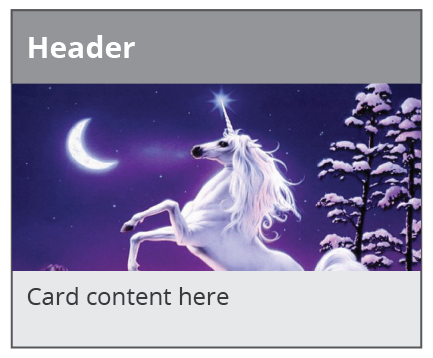
We can see that the class names are specific to cards. Modules and sub-modules allow us to target groups of like content and apply specific styles to them. Our goal is to control the cascade, and use it to our advantage.
State styles
We may want to apply different states to elements on our page, such as hover or active. States are used to signify that something is changing on your page. They give users feedback as they interact with the site and often indicate a Javascript dependency. They are a variation of a module style.
Theme styles
Themes are generally something a user can customize and select. For example, the task management product, Trello allows you to specify what background color you want to use on each project board. This is an example of theming. It’s not terribly common, as many products and websites don’t want to give users control of their company branding elements in this way.
File Structure
Now that we have a clearer idea of how to approach naming and organizing our content, we can go a step further and talk about breaking our styles into multiple files. On small sites, using a single stylesheet isn’t going to cause too many problems. Once a site grows to several pages, or if you have layout elements with complex content, a single stylesheet becomes very hard to manage.
We have been working with all our styles in one stylesheet so far, but from an organization perspective, it would be a good idea to pull out groups of related styles into their own style sheets. This makes it quicker to find specific styles and reenforces a modular approach. This might mean you have stylesheets named something like this:
base.css
navigation.css
hero-unit.css
footer.css
By grouping our styles together by content (or layout) type, we reenforce that we are writing our CSS from a more structural point of view rather than what the particular content inside a particular element is.
Additional Resources
CSS Tricks: Efficiently Rendering CSS
Jonathan Snook’s guide, Scalable and Modular Architecture for CSS